
Business intelligence (BI) dashboards are like CT scans for the brain of your business.
When inspecting the human brain for neurological disorders, doctors read CT scans and look for obvious abnormalities. BI dashboards can reveal similar issues and areas for improvement in a business that are otherwise non-obvious from looking at anecdotal performance data.
An even better analogy for BI dashboards are medical charts and records since they consolidate the information into a single source of truth for doctors to review and make their decisions.
In this article, we cover what BI dashboards are, why they’re beneficial for organizations to implement, and examples of the various types of dashboards.
What is a Business Intelligence (BI) Dashboard?
A business intelligence, or BI, dashboard is a collection of key graphs, charts, tables, and other data visualizations that provide a central location for tracking performance metrics. The dashboard can be optimized around a single metric or comprehensive of KPIs for the entire company.
BI dashboards are meant to be monitored regularly because while they do provide a snapshot into the current health of the business, they also provide historical insight into what contributed to the present situation, which offer opportunities for learning.
Types of BI Dashboards
When considering the various types of dashboards, you might look at BI dashboard examples and, at first glance, assume they are mostly one and the same. The beauty is, a dashboard can be scaled to display the data of a single person, team, department, or entire company.
A sales intelligence dashboard, for example, displays the performance of the sales team exclusively. A startup operations dashboard, on the other hand, might incorporate performance KPIs from multiple departments to monitor the health of the entire company.
Sales Intelligence Dashboard
One of the most important areas of study for business intelligence is sales. Sales are the lifeblood of any business and if you don’t monitor your metaphoric blood pressure, you will compromise the health and well-being of your business.
A good sales intelligence dashboard will include:
- Pipeline at the various stages of your funnel
- Deal size
- Team or individual rep performance
- Revenue growth (MoM, YoY)
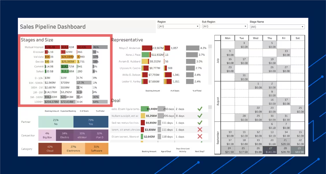
Notice in the sales dashboard above, the color scale helps sales managers quickly visualize and inspect for any leaks or weaknesses in the pipeline. In this specific example there appears to be a shortage of prospects in the “discover” phase, but further categorization by deal size helps clarify that the funnel is healthy.
Marketing KPI Dashboard
Marketing dashboards will be different depending on the type of marketing, such as social media, paid advertising, or content marketing. The common KPIs you will often find in a marketing dashboard include:
- Organic traffic
- Social media engagement
- Marketing Qualified Leads (MQLs)
- Click-through rate (CTR)
- Conversion rate
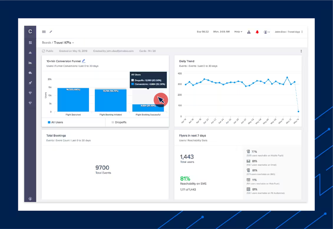
The BI dashboard example above does a great job of focusing on the core KPIs, especially the bottom left quadrant that highlights total bookings, clearly one of the most important business KPIs for this travel app.
It also showcases interactivity with a hover-state tooltip that drills down on the percentage of users that successfully converted a booking compared with those that dropped off in the process.
Operations Dashboard
An operations dashboard allows a single person or small group of people to review and manage the day-to-day productivity of many as they navigate development, production, deployment, and availability.
Some example KPIs you will often see featured in an operations dashboard include:
- Productivity per team/employee
- Error rates
- Availability
- Cost tracking
- Inventory and supply chain management
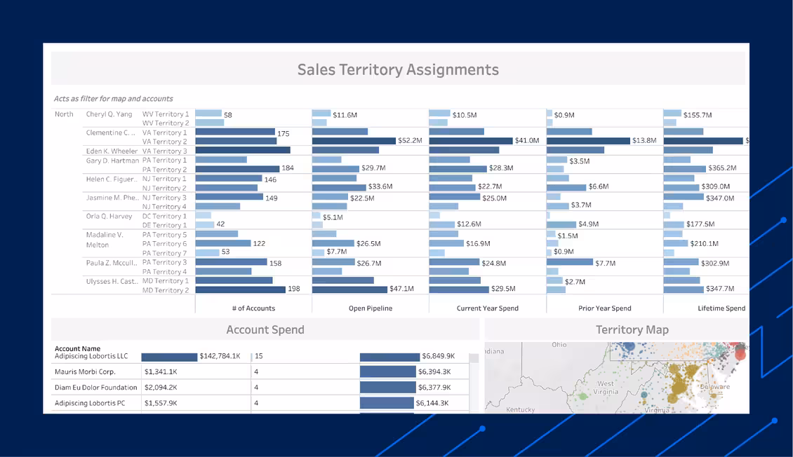
The operations dashboard example above makes it easy to get a quick pulse check on the status of the open pipeline, total number of accounts each rep is managing, and even a territory map to quickly see where accounts are being effectively managed and won.
Benefits of a BI Dashboard
BI dashboards distill large and complex datasets into digestible visualizations which is a benefit in and of itself. If you’ve ever opened up a large spreadsheet with row upon row of data, it’s not hard to imagine how long it would take to compare each cell and make actionable assessments. BI dashboards to the rescue.
Dashboards can be as siloed or as distributed as your team sees fit, usually determined by company size. Small startups, run by a few key people typically leverage a comprehensive dashboard for their sales, marketing, operations, and more into an all-in-one BI dashboard. Large multi-departmental enterprises, on the other hand, usually rely on separate dashboards for each function based on the metrics that help each team measure success.
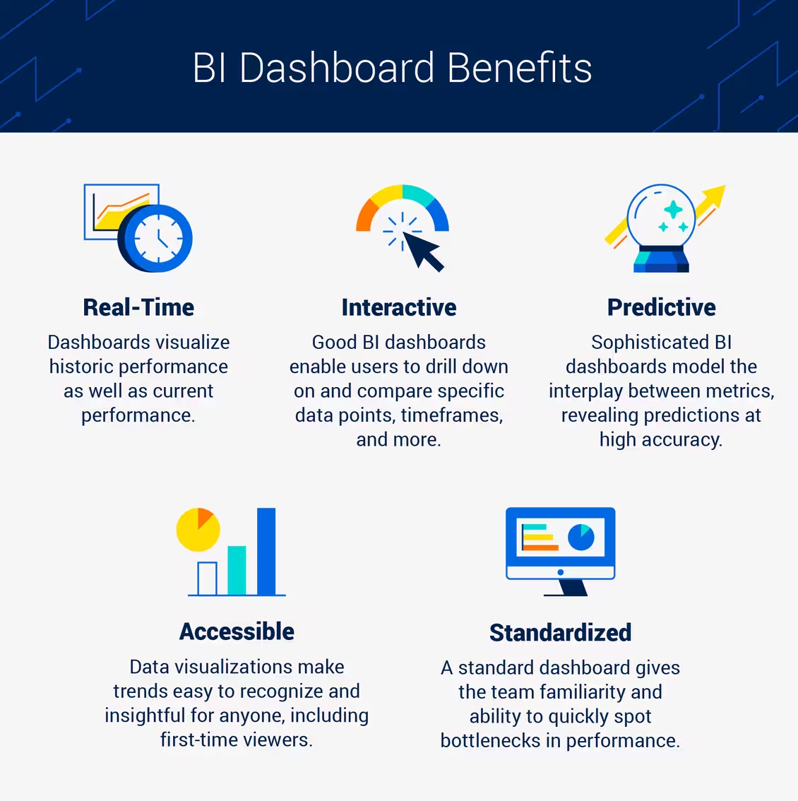
1. Real-time data
One benefit of BI dashboards is giving context around how the business has performed in the past, usually the recent past, as a snapshot of recent and current performance. The emphasis on real-time data helps keep business intelligence up-to-date and able to spot issues sooner and make adjustments faster.
2. Focused and Standardized
Another benefit of BI dashboards is that they are typically focused on your core business KPIs and standardized, meaning each time you come back to your dashboard, you should expect to see the same vital metrics in the same location.
BI dashboards are meant to be accessible by a single person, which forces them to be the hub for the data that really matters. The focus will be different for the various types of dashboards, as assessed in the examples above.
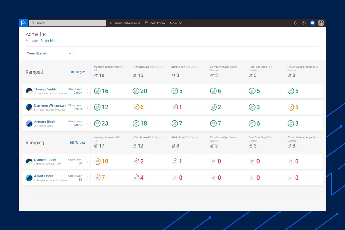
In the example above, sales managers are able to eliminate distractions when analyzing their team’s performance with a leading indicator dashboard. This gives the sales leader a single source of truth when evaluating performance.
3. Interactive
BI dashboards are standardized and focused, but they should also be interactive, offering the analyst a playground to manipulate and learn more about the data. One interaction that is crucial for BI dashboards is the ability to control the timeline and compare to previous periods.
For example, when you open up your dashboard, it will likely default to a day, week, month, or other period of time to view your absolute performance. But where the insights really come from are the ability to compare relative performance to a previous period.
4. Accessible
To pull on another analogy, one that likely contributes to the etymology of the term “BI dashboard,” the dashboard of your car is a great example of what it means to be accessible. If you were to look at the dashboard of your car’s make and model in a foreign country, it would look nearly identical to yours because the data is visualized in a clear and easy to understand medium.
The dashboard is also accessible to the operator when and where it is needed – when the driver in our analogy wants to monitor their speed or fuel levels. Today, BI dashboards can be accessed on mobile cloud devices, giving operators the insights when and where they need them.
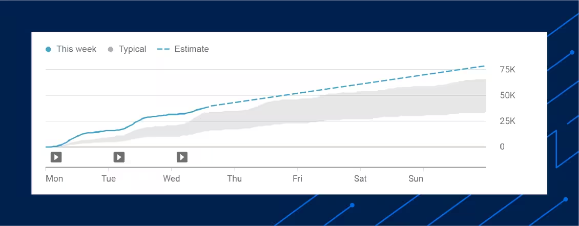
5. Predictive Insights
Sophisticated BI Dashboards will offer more than just a snapshot of the current situation, but also projections based on current trends. These predictive insights are helpful for analyzing the impact of recent changes and the performance of split tests.
One example comes from YouTube Studio where views are tracked against the historical average, predicting week over week growth.
Potential Downside to BI Dashboards
It’s worth noting that there can be a potential darkside to dashboards that show up in the form of vanity. Becoming addicted to the dashboard is a possibility, spending an inordinate amount of time analyzing your performance data instead of working to contribute to growth and progress. Schedule a regular time to review your dashboard and stick to that schedule to avoid this pitfall.
Dashboards vs. Reports
You might be tempted to hand your boss a screenshot of your dashboard and call that your sales report. While they do include similar, if not the same, metrics, they serve entirely different purposes.
Your BI dashboard is a great tool for tracking performance on a routine basis, but the sales report is where the team must decipher the data into lessons, insights, and action plans for course correction or accelerated growth.
A sales report is like paint by numbers; you must compose the data points in a way that paints a picture for your boss to understand the why and how of your performance and strategy.
BI Dashboard Best Practices and Tips
BI dashboards are usually customizable, which allows for the analyzing and fine-tuning of metrics that matter most. Whether you use a default dashboard or customize your own, there are a few things that you should be cognizant of and implement in your dashboards.
Know The KPIs That Matter
This might seem obvious but it’s worth stating: have a firm grasp on which metrics actually matter for your business. As previously mentioned, vanity can cause people to continuously refresh their dashboards, focusing on the metrics more than the actions that influence them.
Vanity metrics are another pitfall for business intelligence teams to avoid. Vanity metrics are the visually appealing albeit unimportant measurements of a business that lead one to believe everything is following the hockey-stick growth curve. An example of a vanity metric could be the quantity of sales calls made versus the ratio of closed sales to total sales calls, which is a far more indicative metric of performance.
In his book Measure What Matters, legendary Venture Capitalist John Doerr advocates that measuring the key results in the form of KPIs can help the business achieve their objectives and overarching mission.
Use Simple and Clear Visualizations
Just as overwhelming as opening a spreadsheet of raw and unfiltered data, a cluttered and complex dashboard can detract from its purpose. Good BI dashboard design comprises simple charts comparing a maximum of two or three metrics at once, ideally focusing on one metric per graph.
Using simple visualizations helps users immediately understand what is being revealed by the underlying data. When possible, use colors to quickly signal the status, such as green for growth, red for loss, and yellow for unchanged.
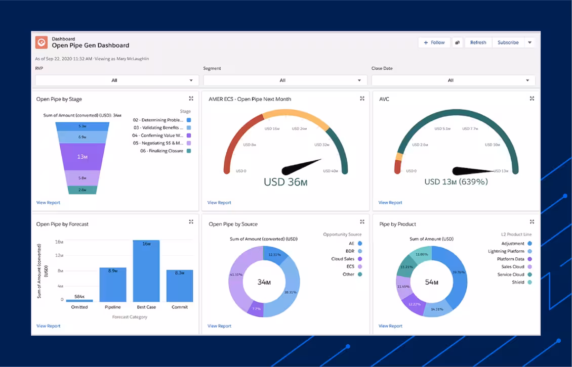
The example above does a great job of incorporating diverse but clear visualizations of what the data represents. From pie charts delineating sources and products, to gauge charts indicating the financial health of the pipeline and a breakdown of the actual funnel by stage.
Conduct Regular Performance Audits
One of the most crucial components of a BI dashboard has nothing to do with the dashboard itself, but the process of monitoring regularly. Depending on your business model or team size, the cadence of checking your dashboard will be different, but the discipline and regularity of reviewing the data should be unwavering in practice.
It’s important to take note of any major changes or shifts in strategy to monitor how they impact performance.
The Key Ingredient to Business Intelligence: Quality Data
No matter the time or resources spent on building your BI dashboards, if there’s little confidence that the underlying data is complete, accurate, or up to date, even the most sophisticated dashboards won’t truly serve their purpose. The key first step in this journey is ensuring that quality data is flowing into your systems of record.
People.ai is the only Revenue Operations and Intelligence (ROI) platform that solves the data quality problem that’s been plaguing sales and marketing teams for years. By automating the capture of business activity such as email, meetings, and contacts, businesses avoid the common pitfalls that come with manually capturing and maintaining customer and prospect data.
With artificial intelligence (AI) and machine learning (ML) matching strategies, activities are automatically associated with the corresponding opportunity or account record within CRM. Not only does this provide more context on where and how data is being generated but allows the business to operate on actual facts rather than anecdotes and gut instincts.
Related Insights
Explore more expert insights on AI adoption, sales execution, and revenue intelligence to help your team close more deals with confidence.

.avif)